NerdWallet iconography
Role:
UI design, design system
Team:
SB Zoto, Deena Khattab, Taylor Higashi, Keethu Lakshmanan, Jay Borelli – design
Icon studio was a design system initiative to help redefine how we’re using iconography and introduce a new system of icons that can create visual consistency across all NerdWallet experiences. The initiative partnered designers and PMs to redesign and implement the new iconography.
The problem space
NerdWallet has gone through a number of evolutions since it launched in 2009. With its growth over the years came some design debt, including disparate iconography systems that often lived in the same environment. We found little consistency in the initial audit, including the homepage, content pages, and app which also lacked icons for new and emerging categories and verticals.
The solution
We came together to identify our primary goals:
• Find a holistic approach to icons
• Redesign our iconography to better reflect the current aesthetic
• Set guardrails and rules around icon usage and design
• Create consistency across all experiences
To get there, we created a framework of how we’d achieve this:
• The product team led a comprehensive audit of icons used in all our experiences
• Product and brand created a set of principles and guidances that shaped both our work and what we disseminated for how to design and implement the icons
• Identified five key surfaces to stress test our designs in as proof of concepts
• Iterate on design explores. Then iterate again, and again, and for good measure – iterate again
Principles and guidelines
Our principles and guidelines are akin to the 10 commandments of icon usage and design across all our NerdWallet channels. They’re intended to guide anyone who decides to use icons or is tasked to design a new icon. Guidelines explain the what, why, and how icons should be used and designed at NerdWallet.
Snapshot of icon usage
• All icons should trigger action, so only use them when paired with an action (e.g., card, text link, UI control)
• Icons convey meaning and function. They should never be used on their own to drive understanding
Snapshot of guidelines
• Icons should be easy to understand.
• Leverage UI convention – if there’s an established symbol or metaphor, use it. Always.
• Design icons with inclusivity and longevity in mind – ensure that icons are culturally-sensitive, non-gendered, and timeless
Design, rinse, and repeat
After a smaller group identified the core placements that would best stress test our icons and concepts, I partnered with a brand and product designer and went wide with explorations. We worked to define the style, color, size (including smallest use cases flagged in the audit), identifying the clearest metaphors, and injecting brand personality. I led the ownership of the brand icons as feedback and iterations continued.
One important differentiator was creating two sets of icons to address the different goals and purposes of UI vs. brand icons. We leveraged a UI icon library from Font Awesome for product experiences while maintaining ownership of brand icons, which are more illustrative while still serving the dual purpose of driving action, clarity, and functionality. They also represent our brand expression, creating an opportunity to let our nerdy personality shine through.
The rollout
Once we presented to multiple stakeholders and took it on a road show, we put our attention to how we’d roll out this work. First up was continuing conversations with various engineers on the complexities of implementing. One of the biggest hurdles was the sheer number of libraries in each app (in the hundreds) that the engineering teams used, and not all spoke to each other.
We also knew this iconography would continue to scale, so some level of maintenance was required.
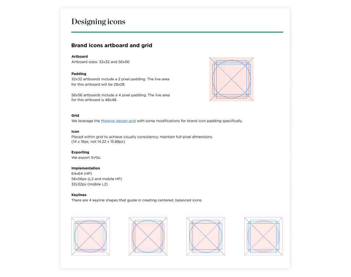
I simultaneously created a comprehensive icon guidelines as a single source of truth for our principles, usage and design guidelines, designing and exporting icons, accessibility, and how to request an icon. As we determined the product team would own UI icons, I collaborated with another brand designer and hosted brown bag sessions to walk through designing icons. This would provide the product team autonomy of creating new icons.
The final set
Takeaways
This was a clean, concise description of the iconography work in comparison to the reality. One of the biggest pain points was that this studio changed hands several times, and most colleagues moved in and out of this project for various reasons – ultimately creating confusion over timelines, ownership, and a lack of clear direction. It was also the first time I designed a full icon set, creating a learning curve that I also had to juggle on top of the aforementioned.
The biggest takeaways were to create clear outlines and scope using a decision making framework that keeps us grounded in ownership, timelines, and expectations. Flexibility and communication were key traits that allowed us to adapt to unexpected challenges, and helped us leverage each other’s expertise to solve for the above. I cannot stress enough the collaboration of the product designers and engineers I partnered with to resolve a number of rollout and implementation issues – their partnerships grew me exponentially.


